

固定フッターの余白をiPhoneXに対応させる
固定フッターにSNSボタンなどを置いている時、こんな感じでiPhoneXだと下の角が丸く切り取られてしまうので余白がなくなってしまったり、下の黒いバーのに被ってしまったりして困るので調べてみました。
viewport
まずはviewportで viewport-fit=cover を指定します。
<meta name="viewport" content="initial-scale=1, viewport-fit=cover">
HTML
<div class="fixedfooter">
  <div class="tw icon">t</div>
  <div class="fb icon">f</div>
  <div class="hb icon">B!</div>
  <div class="line icon">line</div>
</div>
CSS
env(safe-area-inset-xxxxx) という値でセーフエリアまでの距離を取得できます(xxxxxの部分にはleft,right,top,bottomが使えます)
.fixedfooter {
  position: fixed;
  bottom: 0;
  height: 50px;
  height: calc(50px + env(safe-area-inset-bottom));
  width: 100%;
  display: flex;
}

.icon {
  height: 100%;
  width: calc(100% / 4);
  line-height: 50px;
  line-height: calc(50px + env(safe-area-inset-bottom));
  text-align: center;
  color: white;
  font-weight: bold;
}

.tw {
  background: #00aced;
  font-size: 40px;
}

.fb {
  background: #305097;
  font-size: 37px;
}

.hb {
  background: #008fde;
  font-size: 32px;
}

.line {
  background: #5ae628;
  font-size: 29px;
}
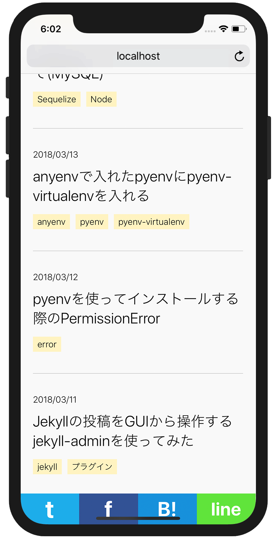
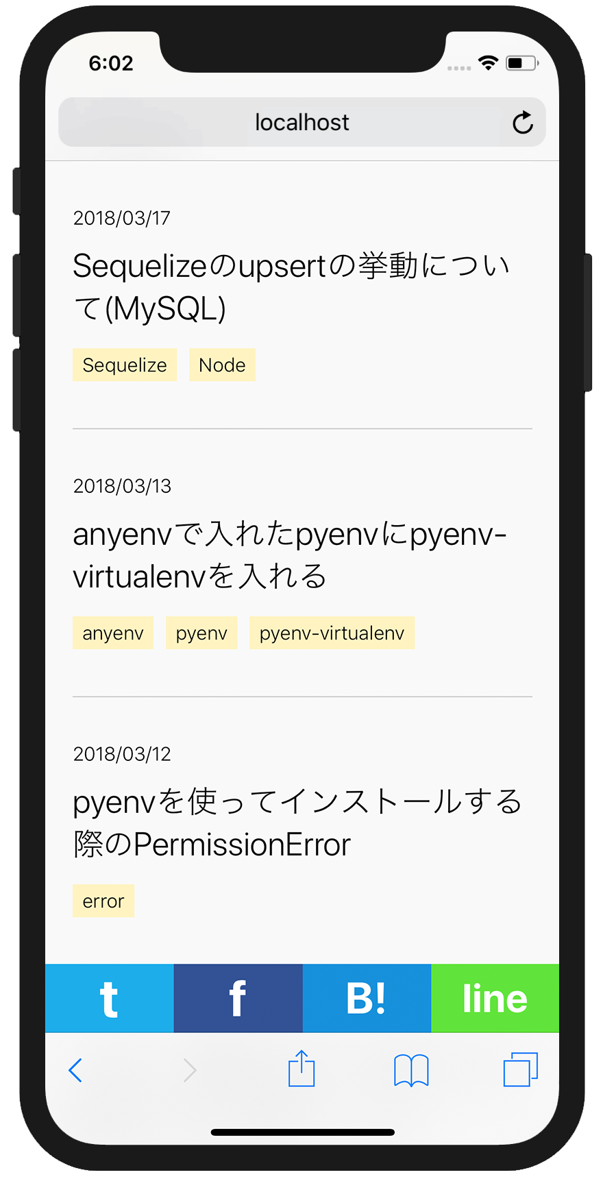
設定後
メニューバー表示時
メニューバー非表示時
動作

参照
https://webkit.org/blog/7929/designing-websites-for-iphone-x/